Getting from Data to Visualization
December 15th, 2014
Someone recently asked me about my process from brainstorming through to delivery; it was a great question without a very straightforward answer so I wanted to share my thoughts more broadly and invite others to do the same.
To start, I interview the customer to understand the end goal. (This can also be conversation with yourself if it’s a personal project). Aside from understanding the background information, I always want to learn the following: What is the main point we want to make to our audience? If there are multiple goals, how can we prioritize them? Knowing these answers helps me decide on the hierarchy of ideas to visually emphasize. At this stage, there is very little discussion about the look and feel. That will emerge with time: the longer you can postpone pigeon-holing the design, the better.
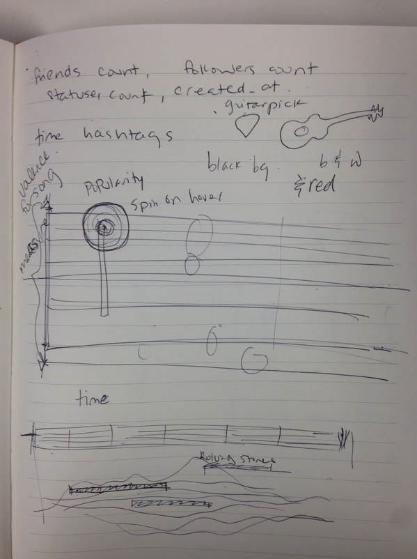
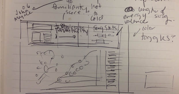
I suggest sketching out an assortment of thumbnails of potential designs. Keep your mind open to different ideas. Trying out ideas with pen and paper saves a lot of time later on because if you identify a bad idea, it’s much less painful to throw it out since you haven’t invested much time and effort. Figures 1 & 2 show some example sketches; don’t worry if they are messy as long as they give yourself a record of your ideas.
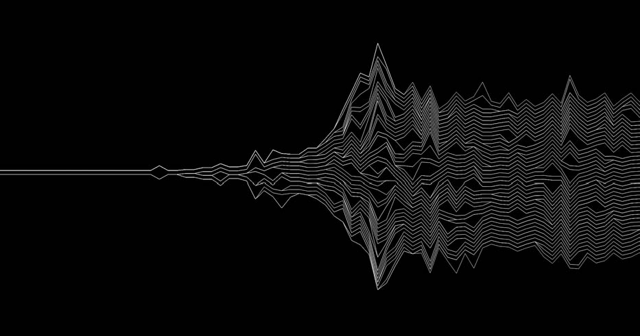
After sketching ideas, I experiment with the custom data visualizations by coding proofs-of-concept. I am most comfortable using d3.js but there are many solutions out there. Figure 3 is an example of a quick sketch using d3.js to understand how a sketch looked with real data. It doesn’t need to be fancy, just enough to get the concept across so you have time to explore other ideas.
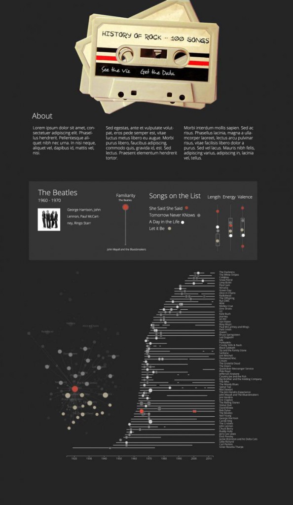
After deciding which ideas are the most promising, I create a mockup using Photoshop. At this stage there is plenty of jumping back and forth between sketching, d3.js sketching, and Photoshop while refining ideas. I have fallen into the trap of coding from a sketch and playing around with the style sheets to figure out the design, but I’ve learned that separating the design side from the development side is much more efficient. They require different skills and trying to design while developing is more difficult and frustrating.
Once I’m happy with the visual design, I start building. The initial development is the most exciting and gratifying part of this whole process. Relative to the entire development process, once I’ve created the initial data visualization prototype I’m really only 30% of the way there.
I spend the remaining 70% of my time iterating and tweaking the finer (but undoubtedly most important) parts of the UI/UX. This starts with trying to put myself in a user’s perspective to try to identify areas of confusion which can be edited or removed. But, most importantly, this phase involves multiple rounds of user testing. In most cases, the users won’t have any context for understanding the data visualization aside from what I put in front of them. It is difficult to watch them interact with it without jumping in, but exercising restraint unveils the problems more clearly. I find this to be the most tedious part, but it is vital to the success of designing good data visualizations.
Understanding a major problem set and then synthesizing that information into actionable design tasks is the key to turning data into useful visualizations. I would love to hear what has and hasn’t worked for you during that process: let me know on Twitter.
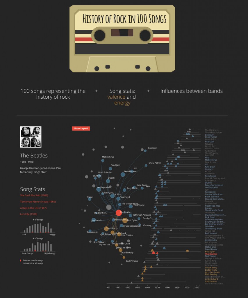
For more information on the example visualization in the figures, see Visualizing the Evolution of Rock Music.

