Analyzing Caltrain Delays: What We Can Learn
March 10th, 2016
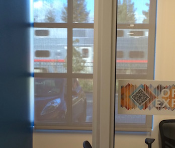 Many people who live and work in Silicon Valley depend on Caltrain for transportation. Here at SVDS we’ve long had an interest in Caltrain because our headquarters have always been close to its tracks, first in Sunnyvale and now in Mountain View. Caltrain is literally in our backyard. About half of our employees regularly commute on Caltrain.
Also, we just like trains.
But along with our fascination with Caltrain is some frustration. Caltrain provides a “real-time” API of expected train departure times by station. As with many systems we interact with in our daily life, when they work, they are almost invisible and we take them for granted. But when their performance fails or degrades, they suddenly seem very important. When Caltrain delivers you on time to your destination you may not give it a second thought, but if you’re ten minutes late to a critical meeting — or you miss a flight — you may develop very “strong” feelings about it.
Yet, uncertainty can be more aggravating than failure. You may not mind that a train is 10 minutes late as long as you can rely on that fact. For this reason, we’re ultimately interested in modeling Caltrain delays so we can make more reliable predictions.1
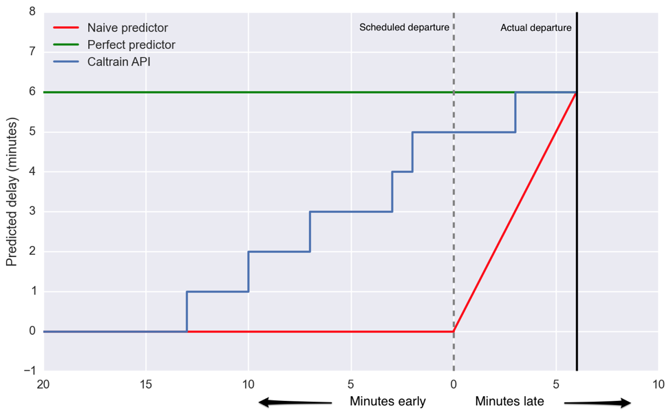
In Figure 1 below, we see the performance of three forecasts up to 20 minutes before train 138 is scheduled to depart Palo Alto. A perfect predictor (green) would have told us the train was running six minutes late over that entire time. That’s enough advance notice for me to know I can finish my coffee and Atlantic article before I have to head out the door. On the other hand, a poor “predictor” (red), which is not really a predictor at all, says the train is on time until it’s not, and then simply tells you how late the train currently is. The closer a predictor is to the horizontal green line, the better it is. The currently available Caltrain API (blue) is somewhere in between. At 10 minutes out, it still says the train is only a minute late, and then just increases from there.
Is that the best we can do? We think not. In this case, the train was already four minutes late at Hillsdale, 20 minutes before it arrived at Palo Alto. We can tell that the Caltrain API does not include this prior knowledge to create a better prediction because its “prediction” starts at 0 delay.
In this post, we will explore some aspects of the train delay data we’ve been collecting from the Caltrain API over the past few months. The goal is to get our heads into the data before setting off on building a prediction model. Be prepared — we ask more questions than we answer! This preliminary exploratory analysis is often important for doing effective feature engineering and model evaluation (to be discussed in later posts). This understanding-first approach stands in contrast to some prediction competitions and machine learning tasks where participants may care little about the meaning of features they are given — if they are told at all! But as our name says, we do data science for business clients that want actionable insights more than one-off models.
So, as an R&D project, we have been playing with data science techniques to better understand and/or predict movement of trains within the Caltrain system. We want to apply data science to a variety of local, distributed, redundant, and possibly unreliable information sources in order to understand the state of the system. Data sources are never completely reliable and consistent across a large system, so this gives us experience producing predictions from messy and possibly erroneous data. For this reason in the past we’ve analyzed audio and visual signals from the trains.
Show me the data!
Our dataset was scraped from Caltrain’s API and includes 83 days from Sep 25, 2015 to Feb 16, 2016. The API attempts indicate how much longer until a train will depart at each station (Table 1). As we’ve seen, Caltrain’s real-time prediction is not a reliable predictor of when a train will depart, but we believe that it’s reliable for detecting when a train has departed (most of the time…). This information, along with the schedule, allows us to see how Caltrain performs: its on-time performance, when and where it accrues delay, and so on. Here is a small sample of our data:
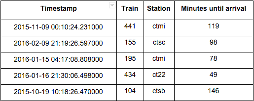
Table 1: Random sample of 5 rows from scraped API data. Keep in mind when interpreting figures and analysis that “Minutes until arrival” is only reported with minute resolution.
The Station column is a short code used by Caltrain: ctmi is the Millbrae station, ct22 is the 22nd Street station, ctsb is San Bruno, etc.
In general, we take a station-centric view of the system; we look at trains as they leave stations (we don’t have data of when they arrive.) From this perspective, delays are accrued at stations.
There are three classes of train — local, bullet, and limited — which differ mostly in which stops they make. We will see that they have different delay characteristics, and so we will often examine them separately. For example, we can already see surprising features in the delays simply by plotting the delays at each station for a particular train.
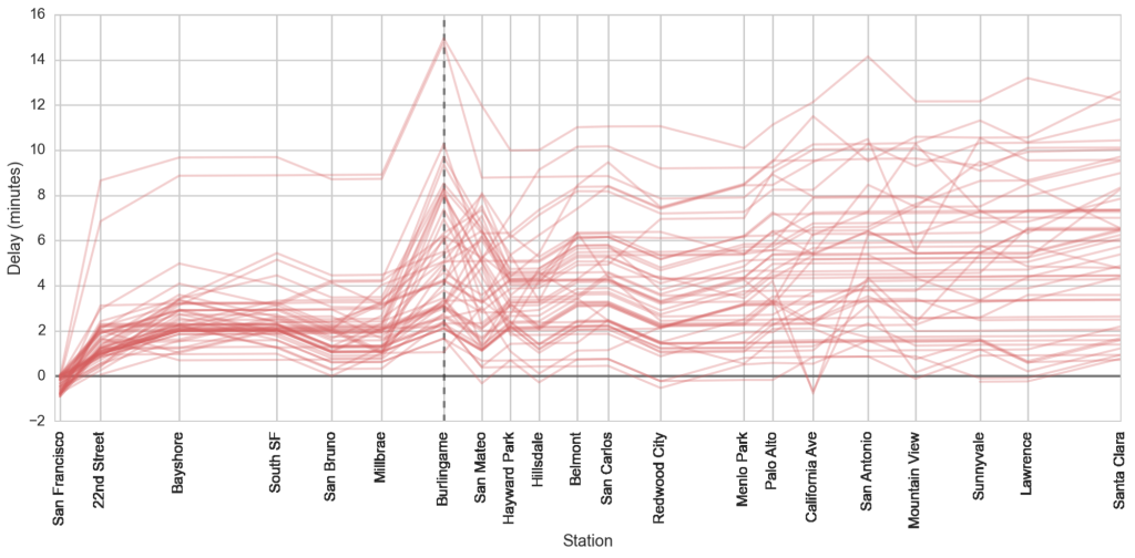
Figure 2 below shows the cumulative delays of local train 138 as it goes southbound from San Francisco. Notice that there’s a prominent recurring upward spike in delay at the Burlingame station. But why? This occurs for limited trains as well, but Figure 3 shows that the effect is less pronounced for northbound trains and in the opposite direction (i.e. a downward bump).
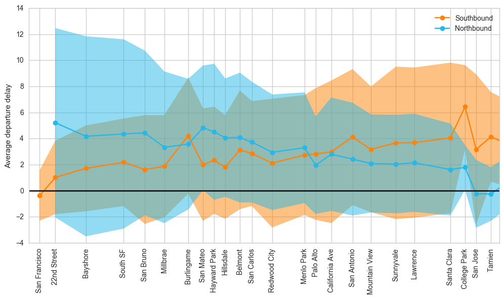
Figure 3: Delay for weekday northbound and southbound trains by station, scaled by geographical distance. The shaded area indicates the standard deviation of recorded delays. Credit: Daniel Margala
In both Figure 2 and Figure 3 above, we see that as trains move down the line, they accrue delays in accordance with our expectations. This also quickly sets our understanding of the magnitude of the problem. On average, accrued delays are on the order of 5 minutes, but as we see from the standard deviations, there is a huge variation for any particular train. The question becomes: can a model of train delays describe that variation sufficiently well to be useful for individual predictions? How much better would it do than a simple model which always predicts the average delay for a given train?
What’s up with Burlingame?
At first glance of the delays for a single train (Figure 2), we saw hints that there may be systematic station effects. Colloquially, we’d say there’s a huge upward spike at Burlingame. An effective way to see this is to compare the delay added at stations. To illustrate this, we switch to a slightly different type of plot, in which the incoming (previous) delay is plotted on the x axis and the outgoing (departure) delay is plotted on the y axis. Figure 4 shows such a plot for Burlingame.
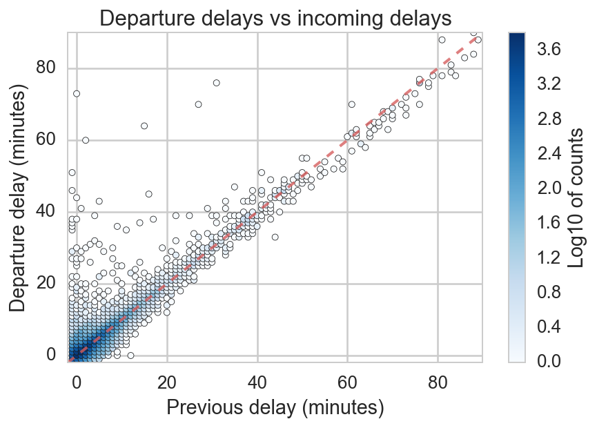
Figure 4: Departure delays vs incoming (previous) delay. Color indicates number of trains with that departure and previous delay (data is reported only to the minute). The dashed red line is the line y=x, or perfect correlation between incoming and outgoing delay.
As you might expect, delay into a station is roughly equal to delay leaving. For a train running perfectly on time, they would be exactly equal, and delays would lie exactly on the red dashed line below. In reality, trains sometimes make up a bit of time (points below the line), but more often acquire additional delay (points above the line).
These quantities are all related quite simply:
departure_delay = incoming_delay + added_delay
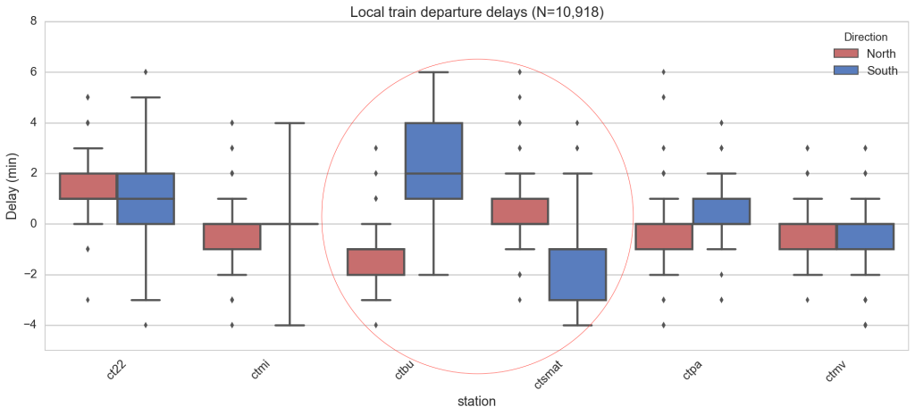
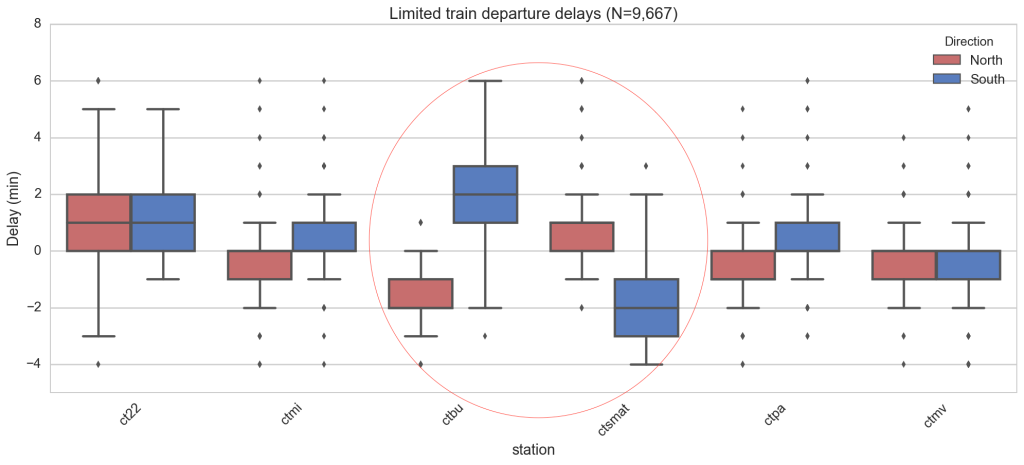
To probe for station-level effects, we study the distribution of these added delays at each station. Note that we have removed outliers here by dropping the most extreme 1% of added delays. We then produce “box and whiskers” plots of the delays (you may recall that a box and whiskers plot shows the mean and the variability of a set of values). Immediately we notice Burlingame (‘ctbu’) and San Mateo (‘ctsmat’) have striking differences between north and south for local and limited trains.
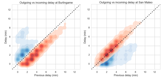
The Burlingame effect is even more striking when comparing the departure (outgoing) delay vs the incoming delay, as in the following bivariate kernel density estimate (Figure 7; left). For all northbound trains (red), no matter the delay at the previous station, the train makes up time. Going south, the trains almost always get behind and in a nonlinear way.
We currently have a working hypothesis for why this is so. Caltrain reports that the API uses data from track sensors and GPS systems on locomotives, which we don’t have access to. Suppose that the track sensors form the bulk of the API data (which seems plausible given the API’s performance). If the track sensors that determine departures from Burlingame station are too far to the south of the station, then every train going north will look a little early, and every train going south will look a little later. In general, we think that there’s a systematic error in the measurement of train departures at that station. One way we can validate this hypothesis is riding the train ourselves with GPS tracking, and check for discrepancies. Watch for a follow-up that explains this mystery.
In San Mateo, the effect is flipped (Figure 7; right). The southbound trains tend to get slower, hence the blue (southerly) distribution lying below the ‘on time’ line that runs along the diagonal.
The bullet trains also had a north/south difference at San Mateo (data not shown), while the weekend bullet has its largest difference at Millbrae. It’s clear that any predictive model will need to account for these large systematic effects, or in a sense, model the distributions in the bivariate KDEs above.
Future work
There is clearly much more that can be explored, like correlations with day of week, time of year or holidays, special events, and ridership data. Stay tuned for more results, and very soon, a better train delay prediction!
![]() One last thing! Caltrain, if you’re reading this, we would love to chat about how to improve prediction times. We have a number of ideas: providing historical and real-time raw data, helping improve the public API predictions, showing real-time location of the trains, and more. Please get in touch with us. We should talk! Email us at trains@svds.com.
One last thing! Caltrain, if you’re reading this, we would love to chat about how to improve prediction times. We have a number of ideas: providing historical and real-time raw data, helping improve the public API predictions, showing real-time location of the trains, and more. Please get in touch with us. We should talk! Email us at trains@svds.com.
Thanks to Daniel Margala and Jonathan Whitmore for lots of consultation on figures, analysis, and wording. Eric White also did some of the original processing, analysis, and visualization of the delay data.
1. Note that there are two notions of reliability here: reliability of the train and the reliability of predictions about train arrivals. We obviously can’t make Caltrain itself more reliable but we’re hoping we can make better predictions about when a train will depart.↩


