
The Basics of Classifier Evaluation: Part 2
December 10th, 2015
A previous blog post, The Basics of Classifier Evaluation, Part 1, made the point that classifiers shouldn’t use classification accuracy — that is, the portion of labels predicted correctly — as a performance metric. There are several good reasons for avoiding accuracy, having to do with class imbalance, error costs, and changing conditions.
The next part in this series was going to go on to discuss other evaluation techniques such as ROC curves, profit curves, and lift curves. This follows the approximate track of our book, Data Science for Business, in Chapters 5 and 6. However, there are several important points to be made first. These are usually not taught in data science courses, or they are taught in pieces. In software packages, if they’re present at all they’re buried in the middle of documentation. Here I present a sequence that shows the progression and inter-relation of the issues.
Ranking is better than classifying (or: Don’t brain-damage your classifier)
Inexperienced data scientists tend to apply classifiers directly to get labels. For example, if you use the popular Scikit-learn Python package, you’ll call predict() on each instance to get a predicted class. While you do ultimately want to predict the class of the instance, what you want from the classifier is a score or rank. Technically, this is the posterior probability estimate p(C|X) where C is the class and X is an input vector.
Nearly every classifier — logistic regression, a neural net, a decision tree, a k-NN classifier, a support vector machine, etc. — can produce a score instead of (or in addition to) a class label.1
In any case, throw out the class label and take the score. Why? Several reasons. First, many classifiers implicitly assume they should use 0.50 as the threshold between a positive and negative classification. In some cases you simply don’t want that, such as when your training set has a different class proportion than the test set.
Second, if you can get scores, then you can draw an entire curve of the classifier’s performance. With a class label you get only a single point on a graph; a curve has much more information. We’ll see that in the next installment.
The final reason is flexibility. You want to be able to rank the instances by score first, and decide later what threshold you’re going to use. Here are some scenarios in which you’d want to do that:
- Say you have a team of six fraud analysts who can handle the average workload. Today two of them called in sick so you’re at 2/3 capacity. What do you do? Using the sorted list, you just work the top 2/3 of the cases you’d normally work. So if you could normally work 100 in a day, today you work 66. This is called a workforce constraint.
- You get a call from a VP who tells you they’re seeing a lot of customer dissatisfaction related to excessive fraud: they’re losing lots of money from fraud, and customers are getting annoyed as well. The VP allocates money for four new temp workers. You now have 10 people (1 2/3 the capacity you usually have). Again, you use the same sorted list but you can work your way much further down than usual — you can get into the “probably not fraud but let’s check anyway” zone.
With only class labels, you wouldn’t have this flexibility. Your classifier would be brain-damaged (the technical term) and could only provide the prediction labels that made sense when it was trained — not when it was used.These scores are commonly called probability estimates (hence the method name proba() in Scikit-learn). I’ll call them scores here and reserve the term probability estimate for another step. The reason will become clear in the final section.
Where do these raw scores come from?
You may wonder how classifiers can generate numeric scores if they’re trained only on labeled examples. The answer is that it depends on the classifier. Here are a few examples to illustrate.
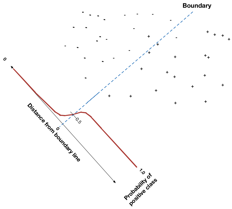
Consider logistic regression, a simple classifier which places a line (technically, a hyperplane) between different classes of points. How would you decide the score of a new, unclassified point? Intuitively, since the boundary separates the two classes, points near the boundary are probably very uncertain. As a point gets further from the boundary, its score (estimate) should increase, until a point infinitely far from the boundary has an extreme estimate (0 or 1). In fact, the logistic equation is used directly to determine a point’s score, as the following figure illustrates:
Consider a very different kind of classifier: the decision tree. A decision tree recursively subdivides the instance space into finer and finer subregions, based on the region’s entropy (informally: the class purity of the region). The decision tree algorithm continues to subdivide each of the regions until it is all of one class, or until further subdivision cannot be justified statistically. So how is a new instance’s score assigned in this scheme? Given a new unclassified instance, you scan down the tree starting at the root node, checking the new instance against the node’s test and taking the appropriate path, until you reach a leaf node. The leaf node determines the classification by checking the classes of the training instances that reached that leaf. The majority determines the class. To get a score, you can calculate it from the instance class counts. If there are 7 positive instances and 1 negative instance in the region, you can guess that all instances in that leaf should have scores of 7/(7+1) = 0.875.2
Consider a k-nearest neighbor classifier, with k set to 5. Given a new, unclassified instance, k of its nearest neighbors are retrieved. To assign a class to the new instance, some function like majority is applied to the five neighbors. To assign a score, simply divide the number of positive instances by the total and return the fraction (there are more sophisticated ways to do it, but that’s the idea). As above, Laplace correction may be used to smooth these out.
As a final example, consider the Naive Bayes classifier. This classifier is different from the others in that it models class probabilities — the posteriors — directly to make a classification. You might expect that Naive Bayes would thus be most accurate in its probability estimates. It isn’t, for various reasons. This leads to the next section.
Why isn’t this regression?
You’ve probably been introduced to classification and regression with the explanation that classification is used to predict labels (classes) and regression is used for numbers. So you may wonder: if we’re interested in a numeric score now, why aren’t we using regression? The answer is that the label type determines the type of problem (and technique). This still is a classification problem — we’re still dealing with classes so the fundamental nature hasn’t changed — but now we want probabilities of class membership instead of just labels. Put another way, the labels of the examples are still discrete classes, so we’re still doing classification. If instead the examples had numbers, we should be using regression.
Calibration: From scores to probabilities
The last section explained how scores are derived from classifiers. In most code I’ve seen, when you ask for a probability estimate you get one of these scores. They’re even called probability estimates in the documentation. But are they?
The answer is: “Well, they’re estimates, but maybe not very good ones.”
What does it mean for a probability estimate to be good? First, it must satisfy the basic constraint of being between 0 and 1. That’s easy to do simply by bounding it artificially. More importantly, it should satisfy a frequency expectation:
If a classifier assigns a score of s to a population of instances, then fractionally about s of that population should truly be positive.
The process of taking a classifier and creating a function that maps its scores into probability estimates is called calibration. If the scores correspond well with probability estimates, that classifier is said to be well-calibrated.
Let’s step back and summarize. There are two separate properties of a classifier. First, how well does it rank (how consistently does it score positive examples above negative examples)? Second, how well calibrated is it (how close are its scores to probabilities)? Your instinct may tell you that one determines the other, but they’re really separate: a classifier can be good at ranking but poorly calibrated, and vice versa.
A common way to show calibration of a classifier is to graph its scores against true probabilities. This is called a Reliability graph. Logically, if a classifier’s estimates are accurate, its score on an instance should equal the probability that the instance is positive. But an instance’s class isn’t a probability; it’s either positive or negative. So the instances are pooled together based on the scores assigned to them.
A well-calibrated classifier would have all points on a diagonal line from (0,0) on the left to (1,1) on the right — or a step function approximating this. A perfect classifier (one which scores all positives as 1 and negatives as 0) would have one clump at (0,0) and another at (1,1), with nothing in between.
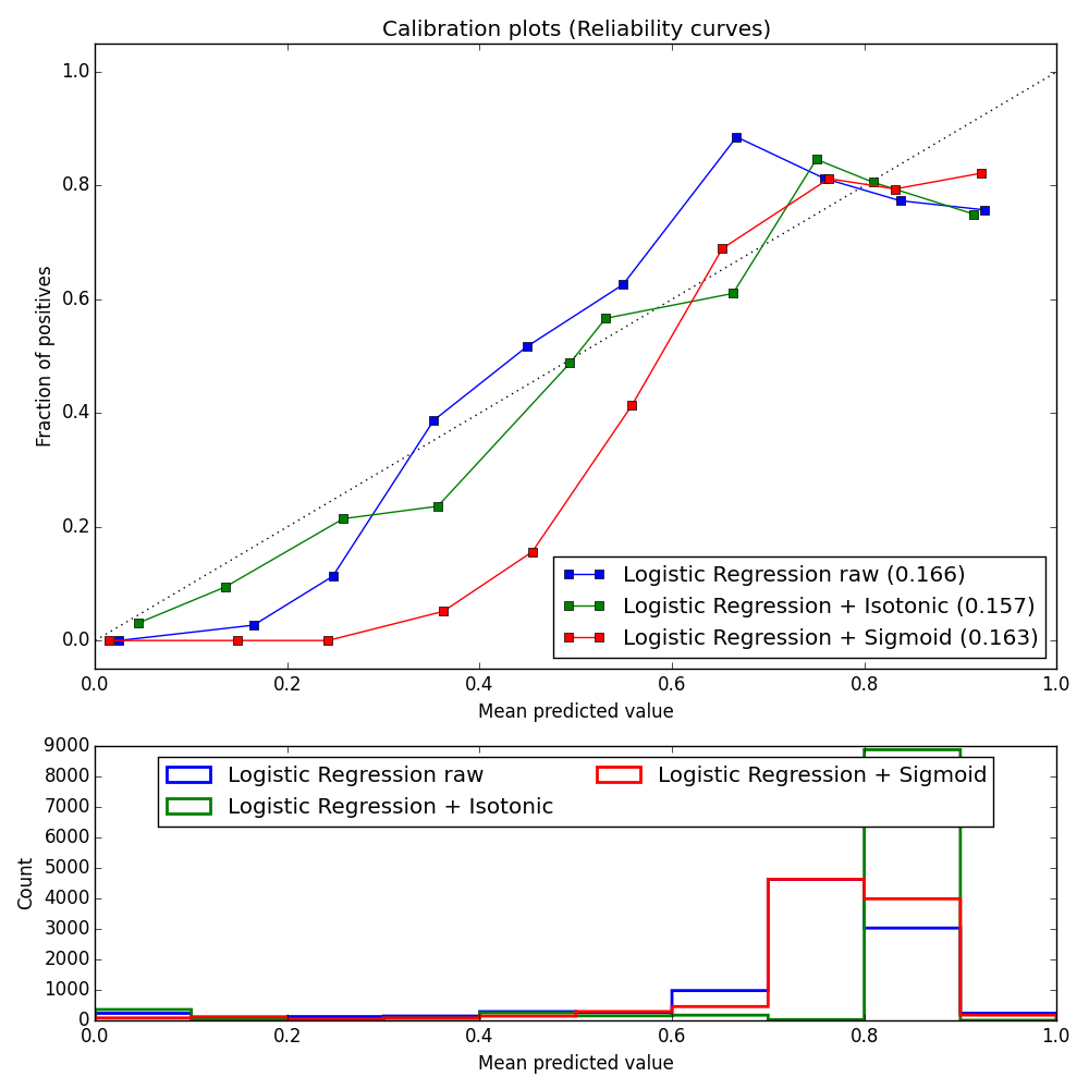
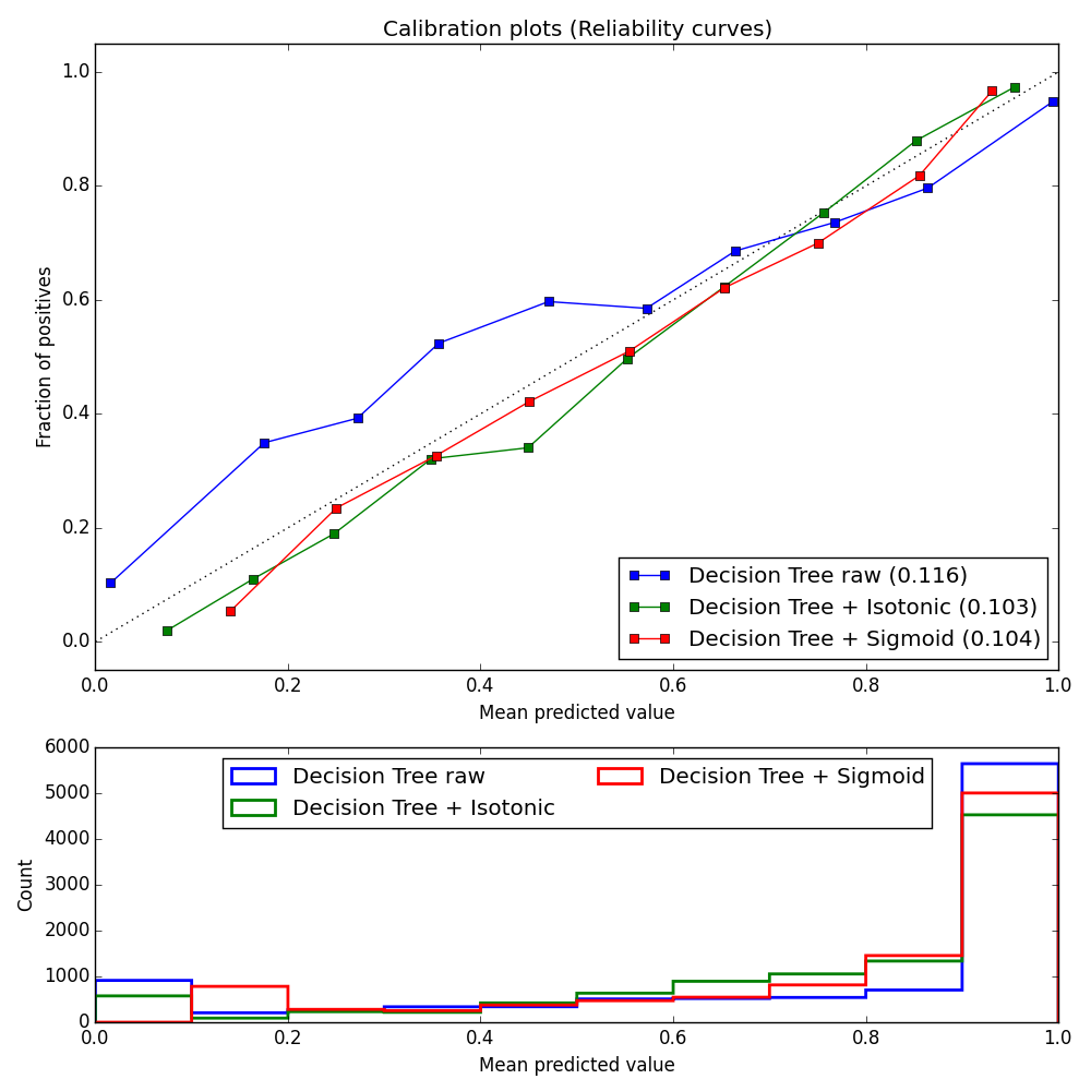
Here are graphs of well-calibrated and poorly-calibrated classifiers.3 Within each legend, in parentheses, is the mean-squared error of the curve against the diagonal (so smaller is better).
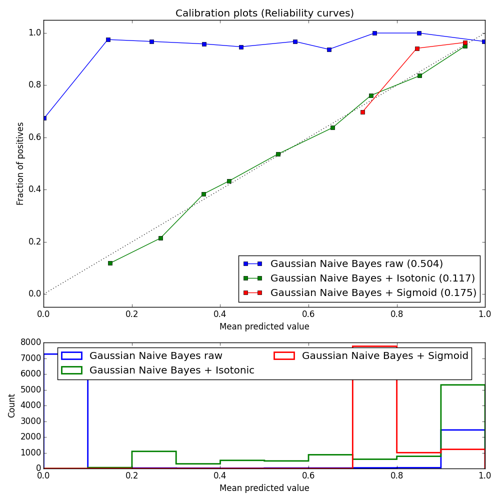
For example, see the graph of Gaussian Naive Bayes before and after calibration. As you can see, the raw scores are very poorly calibrated. Here GNB vastly over-estimates the true probability of examples throughout the ranges of scores, as shown by the blue line being very far above the diagonal throughout. After calibration (see the green line labeled “Gaussian Naive Bayes + Isotonic”) the scores are far better estimates.
Decision trees tend to be well calibrated,4 as you can see in in the figure. The raw scores (blue line) are not too far from the diagonal. Calibration brings the line in a little closer in to the diagonal (see “Decision Tree + Isotonic” and “Decision Tree + Sigmoid”).
If you need a calibrated classifier, the first thing to do is to look at its reliability graph and see whether it’s already fairly well calibrated. If so, just use its raw scores and skip calibration. If not, keep reading.
So what is calibration and how do you do it? Calibration involves creating a function that maps scores onto probability estimates. There are several techniques for doing this. Two of the most common are Platt Scaling and Isotonic Regression. In spite of their imposing names, both are fairly simple.
Platt Scaling (called Sigmoid in these graphs) involves applying logistic regression to the scores. The score of each instance is provided as input and the output is the instance’s class (0 or 1). This is equivalent to fitting the scores against the logistic (sigmoid curve) equation. After running the regression, you have a function f(x)=ax+b for which a and b have been solved. You simply apply f to a score to get a probability estimate.
Isotonic Regression is a little harder to explain, but it basically involves merging adjacent scores together into bins such that the average probability in each bin is monotonically increasing. It’s a form of linear regression that performs piecewise regression. The result is a set of bins, each of which has a score range and a probability associated with it. So the first bin may have the range [0, 0.17] and probability 0.15, meaning that any instance with a score between 0 and 0.17 should be assigned a probability estimate of 0.15.
TIP:
Both of these calibration methods are available in Scikit-learn under sklearn.calibration. In general, Isotonic Regression (a non-parametric method) performs better than Platt Scaling. A good rule of thumb is to use Isotonic Regression unless you have few instances, in which case use Platt Scaling. Of course, it doesn’t hurt to try both.
As a final note on calibration: you may not need to do it at all. Often you just want to find a good score threshold for deciding positive and negative instances. You care about the threshold and the performance you’ll get from it, but you don’t really need to know the probability it corresponds to. The next installment will show examples of that.
What’s next
The next installment in this series will introduce performance graphs such as ROC curves, profit curves, and lift curves. Using these curves, you can choose a performance point on the curve where you want to be. You look up the score that produced that point and use it as your threshold. This is an easy way to choose a threshold that avoids calibration entirely.
For further information
“Putting Things in Order: On the Fundamental Role of Ranking in Classification and Probability Estimation,” an Invited Talk by Peter Flach. There are actually three properties of a classifier rather than just the two discussed here. Flach’s excellent video lecture covers everything and includes examples and algorithms.
“Obtaining calibrated probability estimates from decision trees and naive Bayesian classifiers,” Bianca Zadrozny and Charles Elkan.
“Obtaining Calibrated Probabilities from Boosting,” Alexandru Niculescu-Mizil and Rich Caruana.
“Class probability estimates are unreliable for imbalanced data (and how to fix them),” Byron C. Wallace and Issa J. Dahabreh. 12th IEEE International Conference on Data Mining, ICDM 2012.
Code for reliability curves was adapted from here.
1. With Scikit-learn, just invoke the proba() method of a classifier rather than classify(). With Weka, click on More options and select the Output predictions box, or use -p on the command line. ↩
2. It’s common to perform some sort of Laplace correction to smooth out the estimates, to avoid getting extreme values when only a few examples are present. Smoothed, this score would be (7+1) / (7+1+2) = 0.80. ↩
3. These graphs were all made using the Adult dataset from the UCI repository. ↩
4. In fact, decision trees should be perfectly calibrated because of how they produce scores. In a decision tree, a leaf with p positives and n negatives produces a score of p/(p+n). This is exactly how Reliability graphs pool instances, so the pooled value x always equals the score y. So why aren’t the lines in the figure of Decision Trees before and after calibration perfectly diagonal? Simply because the training and testing sets were slightly different, as they always are. ↩