
Avoiding Common Mistakes with Time Series
January 28th, 2015
A basic mantra in statistics and data science is correlation is not causation, meaning that just because two things appear to be related to each other doesn’t mean that one causes the other. This is a lesson worth learning.
If you work with data, throughout your career you’ll probably have to re-learn it several times. But you often see the principle demonstrated with a graph like this:
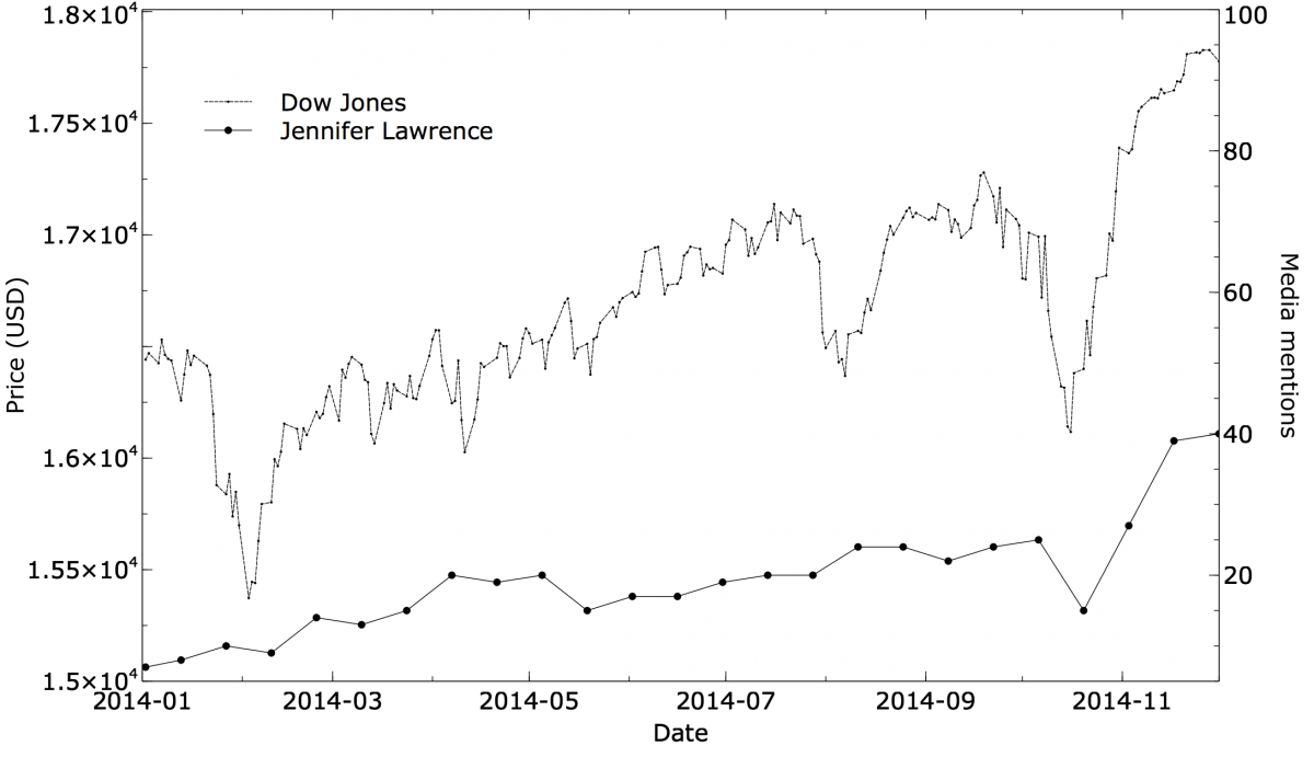
One line is something like a stock market index, and the other is an (almost certainly) unrelated time series like “Number of times Jennifer Lawrence is mentioned in the media.” The lines look amusingly similar. There is usually a statement like: “Correlation = 0.86”. Recall that a correlation coefficient is between +1 (a perfect linear relationship) and -1 (perfectly inversely related), with zero meaning no linear relationship at all. 0.86 is a high value, demonstrating that the statistical relationship of the two time series is strong.
The correlation passes a statistical test. This is a great example of mistaking correlation for causality, right? Well, no, not really: it’s actually a time series problem analyzed poorly, and a mistake that could have been avoided. You never should have seen this correlation in the first place.
The more basic problem is that the author is comparing two trended time series. The rest of this post will explain what that means, why it’s bad, and how you can avoid it fairly simply. If any of your data involves samples taken over time, and you’re exploring relationships between the series, you’ll want to read on.
Two random series
There are several ways of explaining what’s going wrong. Instead of going into the math right away, let’s look at a more intuitive visual explanation.
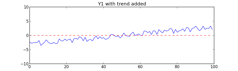
To begin with, we’ll create two completely random time series. Each is simply a list of 100 random numbers between -1 and +1, treated as a time series. The first time is 0, then 1, etc., on up to 99. We’ll call one series Y1 (the Dow-Jones average over time) and the other Y2 (the number of Jennifer Lawrence mentions). Here they are graphed:
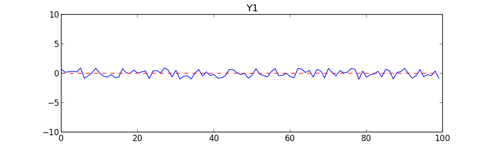
There is no point staring at these carefully. They are random. The graphs and your intuition should tell you they are unrelated and uncorrelated. But as a test, the correlation (Pearson’s R) between Y1 and Y2 is -0.02, which is very close to zero. There is no significant relationship between them. As a second test, we do a linear regression of Y1 on Y2 to see how well Y2 can predict Y1. We get a Coefficient of Determination (R2 value) of .08 — also extremely low. Given these tests, anyone should conclude there is no relationship between them.
Adding trend
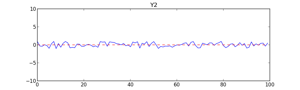
Now let’s tweak the time series by adding a slight rise to each. Specifically, to each series we simply add points from a slightly sloping line from (0,-3) to (99,+3). This is a rise of 6 across a span of 100. The sloping line looks like this:
Now we’ll add each point of the sloping line to the corresponding point of Y1 to get a slightly sloping series like this:
We’ll add the same sloping line to Y2:
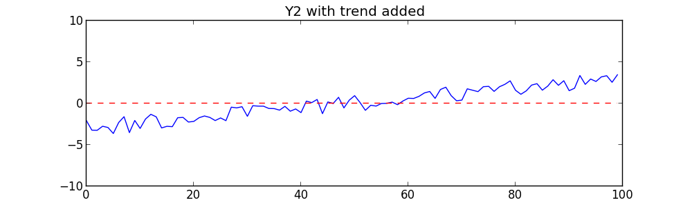
Now let’s repeat the same tests on these new series. We get surprising results: the correlation coefficient is 0.96 — a very strong unmistakable correlation. If we regress Y on X we get a very strong R2 value of 0.92. The probability that this is due to chance is extremely low, about 1.3×10-54. These results would be enough to convince anyone that Y1 and Y2 are very strongly correlated!
What’s going on? The two time series are no more related than before; we simply added a sloping line (what statisticians call trend). One trended time series regressed against another will often reveal a strong, but spurious, relationship.
Put another way, we’ve introduced a mutual dependency. By introducing a trend, we’ve made Y1 dependent on X, and Y2 dependent on X as well. In a time series, X is time. Correlating Y1 and Y2 will uncover their mutual dependence — but the correlation is really just the fact that they’re both dependent on X. In many cases, as with Jennifer Lawrence’s popularity and the stock market index, what you’re really seeing is that they both increased over time in the period you’re looking at. This is sometimes called secular trend.
The amount of trend determines the effect on correlation. In the example above, we needed to add only a little trend (a slope of 6/100) to change the correlation result from insignificant to highly significant. But relative to the changes in the time series itself (-1 to +1), the trend was large.
A trended time series is not, of course, a bad thing. When dealing with a time series, you generally want to know whether it’s increasing or decreasing, exhibits significant periodicities or seasonalities, and so on. But in exploring relationships between two time series, you really want to know whether variations in one series are correlated with variations in another. Trend muddies these waters and should be removed.
Dealing with trend
There are many tests for detecting trend. What can you do about trend once you find it?
One approach is to model the trend in each time series and use that model to remove it. So if we expected Y1 had a linear trend, we could do linear regression on it and subtract the line (in other words, replace Y1 with its residuals). Then we’d do that for Y2, then regress them against each other.
There are alternative, non-parametric methods that do not require modeling. One such method for removing trend is called first differences. With first differences, you subtract from each point the point that came before it:
y'(t) = y(t) – y(t-1)
Another approach is called link relatives. Link relatives are similar, but they divideeach point by the point that came before it:
y'(t) = y(t) / y(t-1)
More examples
Once you’re aware of this effect, you’ll be surprised how often two trended time series are compared, either informally or statistically. Tyler Vigen created a web pagedevoted to spurious correlations, with over a dozen different graphs. Each graph shows two time series that have similar shapes but are unrelated (even comically irrelevant). The correlation coefficient is given at the bottom, and it’s usually high.
How many of these relationships survive de-trending? Fortunately, Vigen provides the raw data so we can perform the tests. Some of the correlations drop considerably after de-trending. For example, here is a graph of US Crude Oil Imports from Venezuela vs Consumption of High Fructose Corn Syrup:
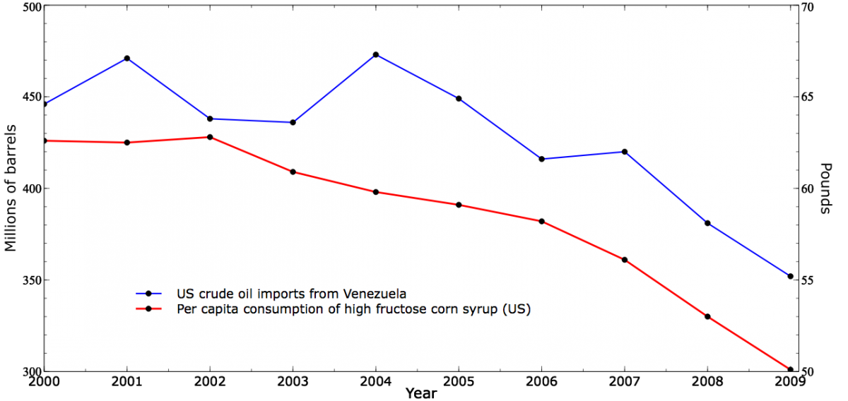
The correlation of these series is 0.88. Now here are the time series after first-differences de-trending:
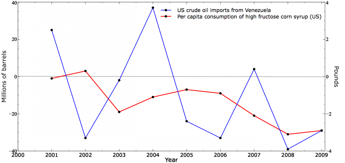
These time series look much less related, and indeed the correlation drops to 0.24.
A recent blog post from Alex Jones, more tongue-in-cheek, attempts to link his company’s stock price with the number of days he worked at the company. Of course, the number of days worked is simply the time series: 1, 2, 3, 4, etc. It is a steadily rising line — pure trend! Since his company’s stock price also increased over time, of course he found correlation. In fact, every manipulation of the two variables he performed was simply another way of quantifying the trend in company price.
Final words
I was first introduced to this problem long ago in a job where I was investigating equipment failures as a function of weather. The data I had were taken over six months, winter into summer. The equipment failures rose over this period (that’s why I was investigating). Of course, the temperature rose as well. With two trended time series, I found strong correlation. I thought I was onto something until I started reading more about time series analysis.
Trends occur in many time series. Before exploring relationships between two series, you should attempt to measure and control for trend. But de-trending is not a panacea because not all spurious correlation are caused by trends. Even after de-trending, two time series can be spuriously correlated. There can remain patterns such as seasonality, periodicity, and autocorrelation. Also, you may not want to de-trend naively with a method such as first differences if you expect lagged effects.
Any good book on time series analysis should discuss these issues. My go-to text for statistical time series analysis is Quantitative Forecasting Methods by Farnum and Stanton (PWS-KENT, 1989). Chapter 4 of their book discusses regression over time series, including this issue.